Weather App
Creative UI | UX Case Study & Design
Overview
This project challenged me to design a minimalist weather application while working within strict creative constraints. The goal was to demonstrate originality and visual coherence by adhering to a single, carefully chosen colour palette and design style. The app needed to communicate functionality with minimal elements while maintaining aesthetic appeal and user clarity.
Role
Position - Sole Designer
Responsibilities - Visual concept development, UI design, style system creation, layout and iconography design, and documentation of design rationale.
Tools Used - Figma, Adobe Illustrator, Protopie
Design Brief
Project Duration - 4 weeks
Tools Used
Figma, Adobe Illustrator & Protopie
Select a design style and theme for the app.
Select a colour palette with one primary highlight colour and neutrals.
Design a consistent set of custom icons and choose typography that aligned with the theme.
Create a cohesive layout and visual hierarchy with minimal distractions.
Timeline
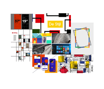
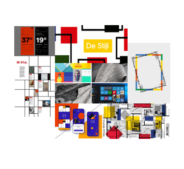
Concept & Style Inspiration
The visual direction was inspired by the De Stijl movement, known for its emphasis on simplicity, geometry, and limited colour use. I wanted the app to feel functional, structured, and serene, reflecting the natural predictability and rhythm of weather patterns.
Colour Palette
Primary Colour - #FFD602 (A vibrant shade of yellow)
Supporting Colours - Various shades of grey and black for neutrality and balance.
Rationale
The chosen primary colour offers a bold but sophisticated accent against a monochrome base. It draws attention to important elements (like today's forecast) without overwhelming the minimalist layout. Greys and blacks create a muted background, enhancing readability and maintaining a sleek, professional aesthetic.
Primary
Light
Neutral
#808080
#FFD602
#F4F4F4
Dark
#1A1A1A
Aa
style: two light, size: 32
style: one regular, size: 96
style: one regular, size: 16
style: one regular, size: 14
style: two light, size: 12
Typography
OSKAR’s clean, slightly geometric letterforms complemented the app’s modern, structured feel. It ensured clarity and maintained visual balance within a minimal interface. It also blends in with the overall aesthetics of the design style and follows the theme.
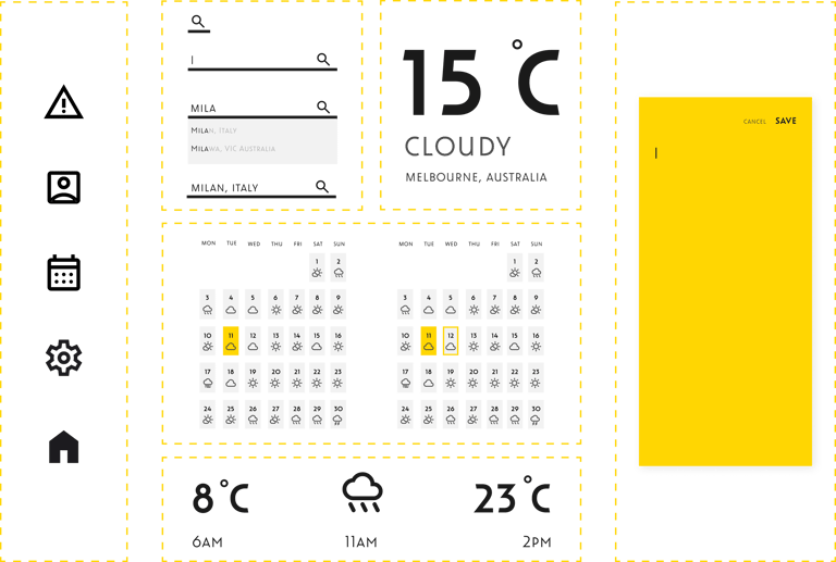
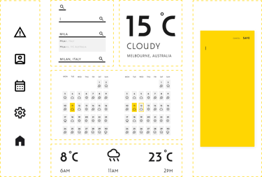
Iconography
Custom-designed icons were created to align with the minimalist, line-based style.
Icons conveyed key weather information (sunny, rainy, cloudy) clearly at a glance, ensuring functional communication without text when possible.
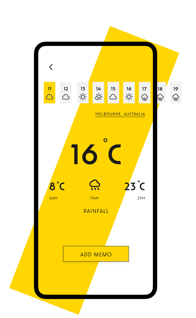
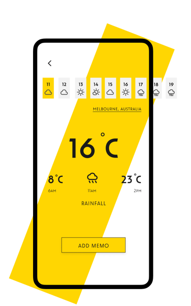
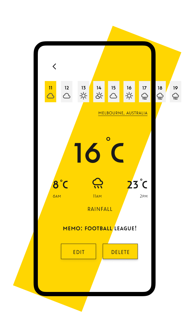
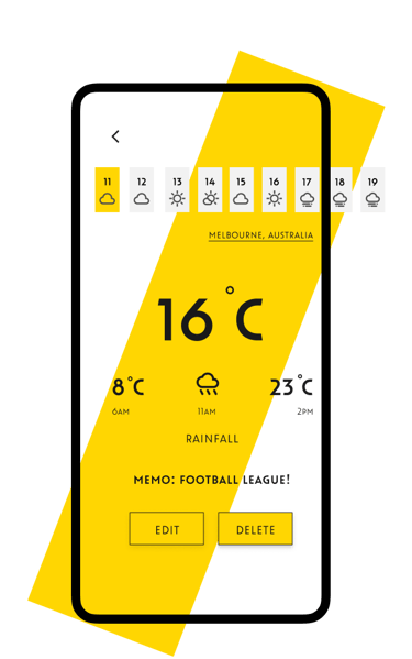
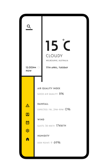
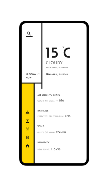
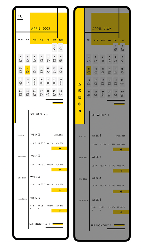
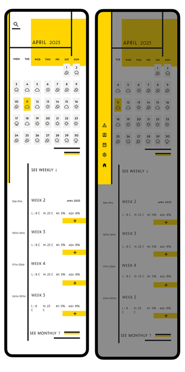
Layout & Structure
A clean, grid-based layout was adopted to maintain order and clarity.
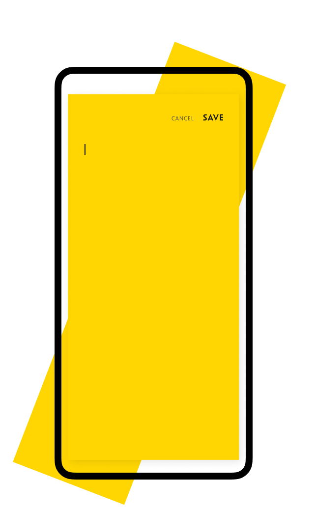
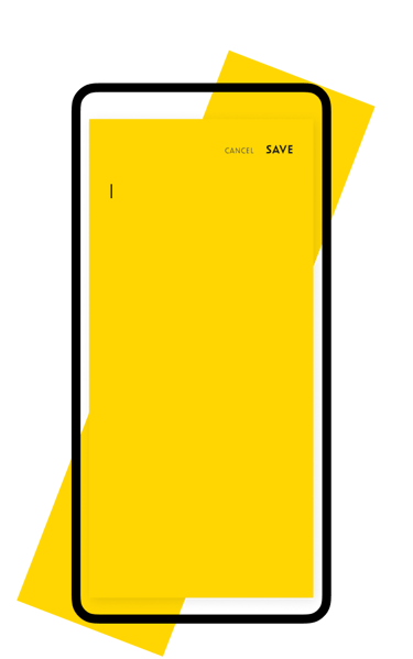
The home screen prioritised immediate weather information, with easy access to memos and calendar events through simple navigation.
The navigation and structure were designed to create a sense of calm and predictability, essential for a tool users would check daily.
Key Sections
Real-time weather display.
Weekly forecast view.
Integrated calendar.
Personal memo section.

Challenges
Working within colour limitations - Crafting visual hierarchy and separation without relying on multiple colours was challenging.
Balancing Simplicity and Information - Ensuring the interface stayed minimalist without sacrificing necessary weather details.
Reflections
This project sharpened my ability to create impactful, clear visual design under strong creative constraints. I learned how much can be communicated with limited colours and simple structures when deliberate choices are made. If I were to continue evolving the app, I would explore subtle micro interactions (like hover effects or animated weather icons) to add a touch of liveliness without breaking the minimalist principle.