


Monash thrive
Product | UX Research & design
Reducing overwhelm for first-time university students by making wellbeing support clearer, calmer, and easier to access.
Role: UX Researcher & Product Designer
Context: Academic / Product Design
Focus: Eliminating friction, duplication, and physical strain in self-checkout
Tools: Figma, Protopie, Adobe Photoshop & After Effects
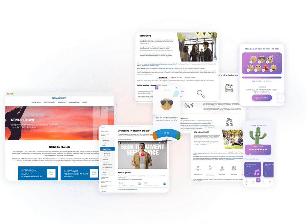
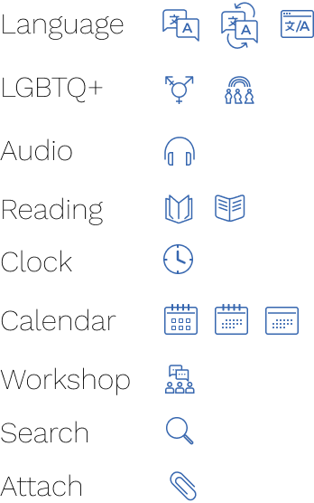
We redesigned Thrive as a Moodle-integrated “wellbeing hub,” with five core modules:
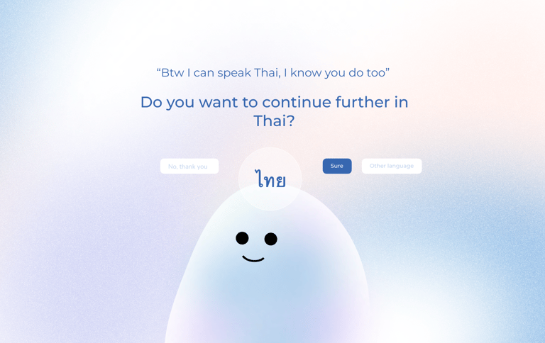
Language selection
Smart Planner with personalised reminders
Counselling access
Workshops & social events
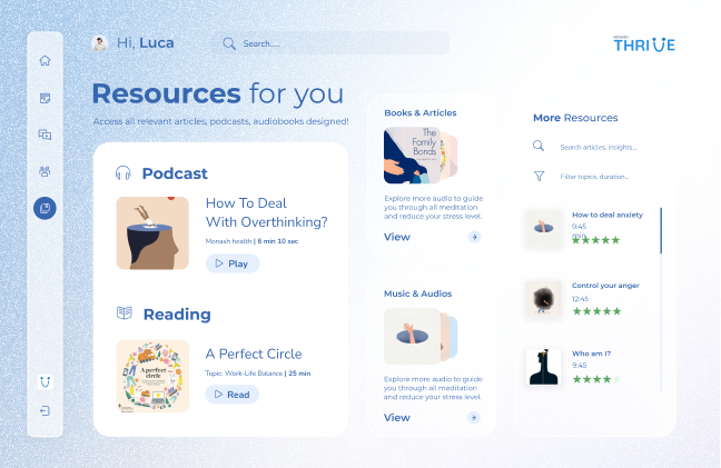
Wellbeing media library (podcasts, audiobooks, tools)
Design highlights

How it works
Students onboard through a short guided flow, answer a few questions to personalise their experience, and land on a dashboard designed specifically for first-time users. From there, they can manage tasks through the planner, access relevant resources, or book counselling sessions directly within the platform, without navigating multiple systems.

The problem
Monash offers a wide range of wellbeing services, but students, especially new international students, often struggle to understand what support exists, when to use it, and where to start.
The issue wasn’t a lack of services.
It was fragmentation, overwhelm, and uncertainty at moments when students needed reassurance the most.
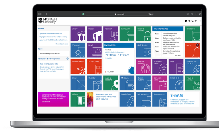
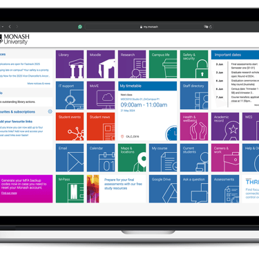
Current website


My role
I worked as a UX/UI designer on this project, contributing across research, insight synthesis, scenario development, and interface design.
I supported user research through surveys, interviews, and co-design workshops, helped analyse findings, and contributed to current and future state journey maps. On the design side, I worked on ideation, interaction flows, and interface design, with a focus on reducing cognitive load and improving clarity for first-time users.
Context & constraints
This was an academic concept project designed within a limited timeframe and scope. The focus was on identifying high-impact opportunities and designing a clear, scalable experience rather than fully polishing every feature.
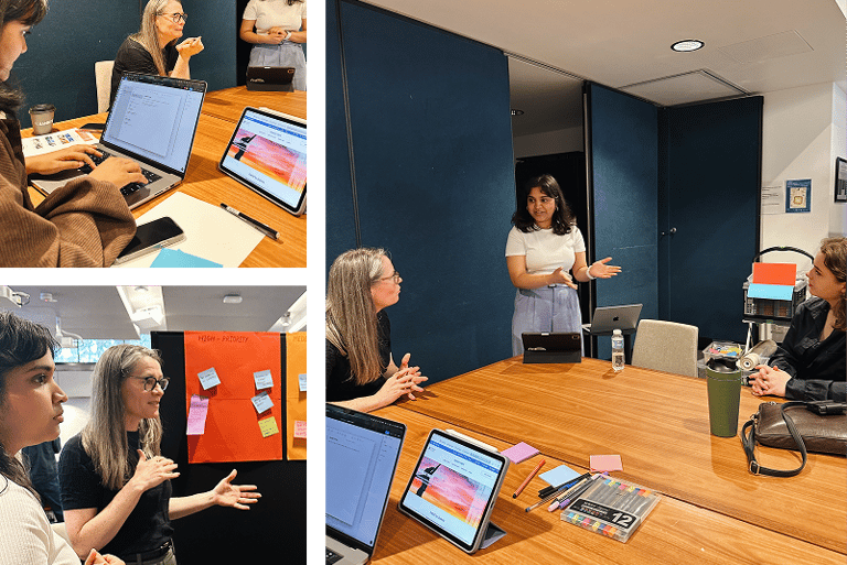
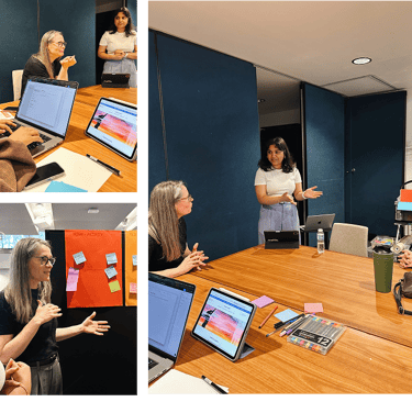
Research and discovery
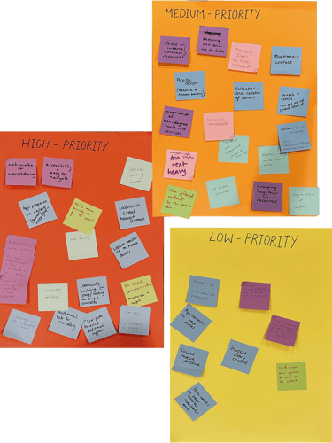
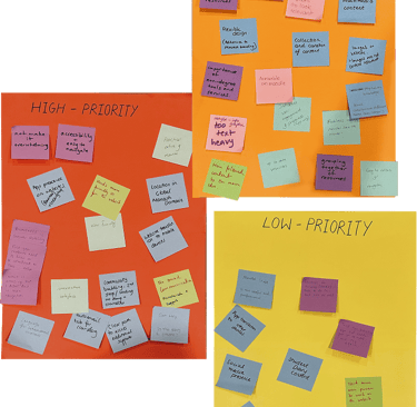
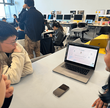
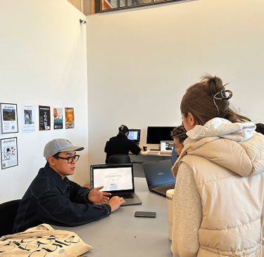
We ran two co-design workshops with 13 participants, including university staff and international students. I supported facilitation, hosted icebreaker exercises, observed participant responses, and captured key feedback.
Activities included:
Work Cloud Icebreaker: Participants described Thrive in 3 words → surfaced 20+ emotional descriptors (unclear, support, overwhelming).
Speed Brainstorming: 85+ sticky notes captured across themes like communication, access, emotional impact.
Priority Mapping: Participants sorted problems into low/medium/high priority zones.
“We’re not just mapping features-we’re mapping feelings,” was a realisation that shaped how we approached the redesign.
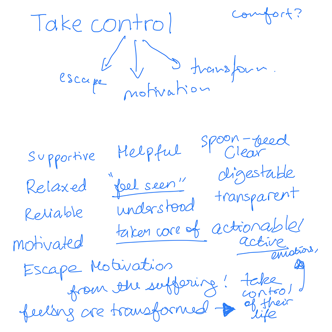
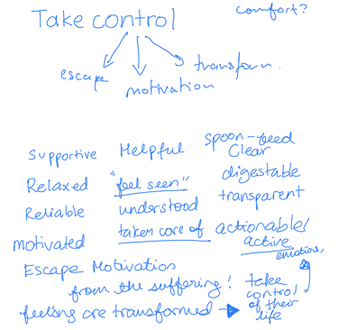
What we learned?
Communication Gap: Awareness was low due to poor promotion-not a platform flaw alone.
Overload = Anxiety: Users felt stressed navigating Thrive’s interface due to dense, unfocused content.
Cultural Disconnect: International students needed simpler language and more approachable tone.
Relevance Matters: Students wanted tailored resources, not generalised suggestions.
Design process
We began by redefining how Thrive should feel- calm, helpful, familiar. This guided both our structure and visual language.
Early decisions & integrations:
Explored multiple navigation models (hub vs. feed-based)
Tested icons and colour palettes to avoid institutional or clinical feel.
Created low-fidelity wireframes collaboratively, redefining layout hierarchies as we tested.
My key contribution: I led the student planer concept- a smart tool linked to student IDs that would display assignments, appointments, and upcoming events alongside wellbeing checkins. I prototyped it in Protopie to simulate interactions like toggling reminders, scheduling counselling sessions, and viewing progress.
Visual research and design style inspiration
For our precedent and inspiration research, we systematically collected data on grids, composition, and colour usage to initiate experimentation with various design elements.
Through collaborative discussions, we established key design principles that our creations must adhere to. These principles include the use of pleasant colours characterised by a cool, light, uplifting, and calming aesthetic, promoting a minimalistic approach.
Furthermore, we emphasised the incorporation of human imagery, particularly featuring students engaged in activities related to mental health and well-being, such as meditation, exercise, and community support. Additionally, we identified customisation as a crucial aspect, intending to integrate features like filters, search functions, pinning favourites, comments, emoji reactions, content input, and personalised recommendations. To enhance visual appeal and engagement, we outlined the inclusion of design elements such as illustrations, audio-visual content (images/videos/podcasts), and the introduction of a cloud character mascot.
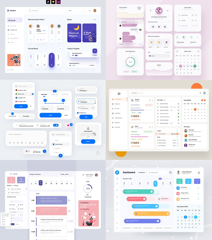
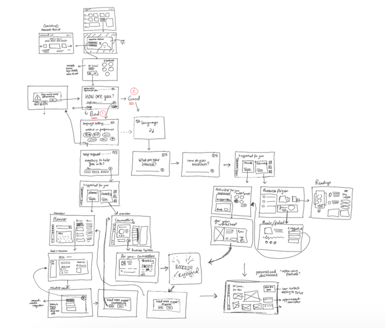
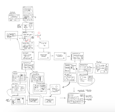
Information hierarchy flow charts
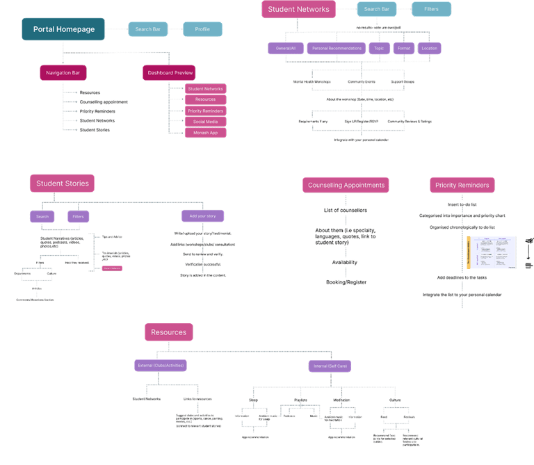
The initial ideation phase for our features involved numerous iterations and transformations as we delved into student stakeholder pain points and needs while leveraging our perspectives as students ourselves to guide the process.
We refined our focus to five key features that emerged as pivotal in addressing these needs. Following the finalisation of these features, we collaborated to map out the hierarchical structure and information architecture required for the design implementation. This mapping process provided invaluable direction for the development of low and mid-fidelity wireframes.
Low fidelity wireframes
Clarifying entry and exit points provided clarity on user navigation pathways and facilitated a smoother user experience.
Branding + mid fidelity wireframes
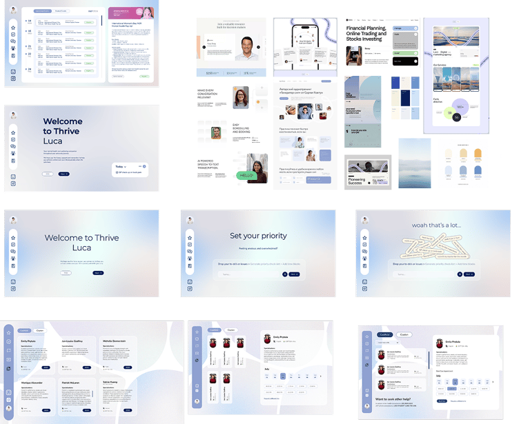
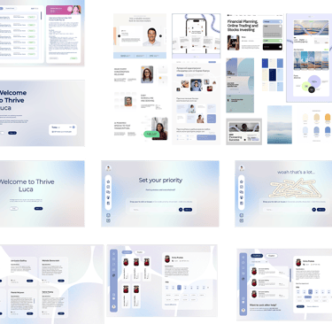
In developing the initial draft of the brand system, we prioritised clarity, simplicity, and minimalism with ample negative space to create a visually engaging and user-friendly interface.
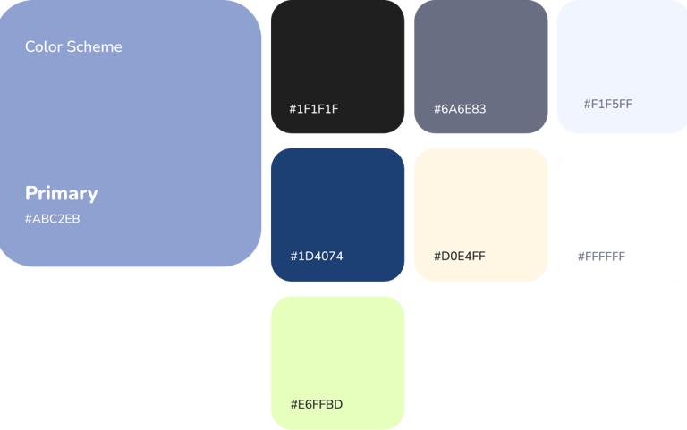
Drawing inspiration from the calming effects of colours commonly used in healthcare settings, such as purple and green.
Design components
Our aim was to have a clean, minimal look and feel. Adding the colours and type weights/sizes into our local file for consistency.
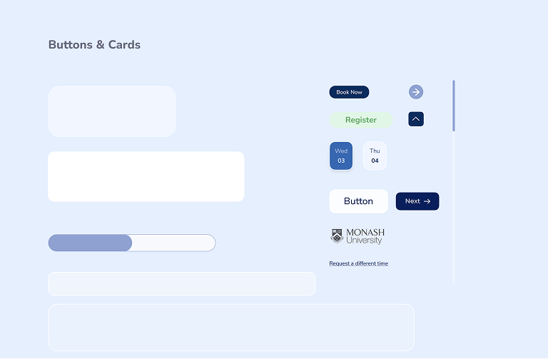
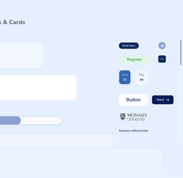


Buttons & components
Typography
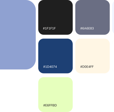
Colour palette
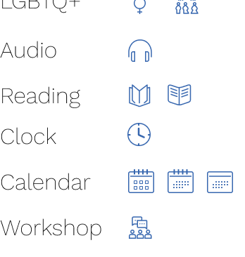
Icon library

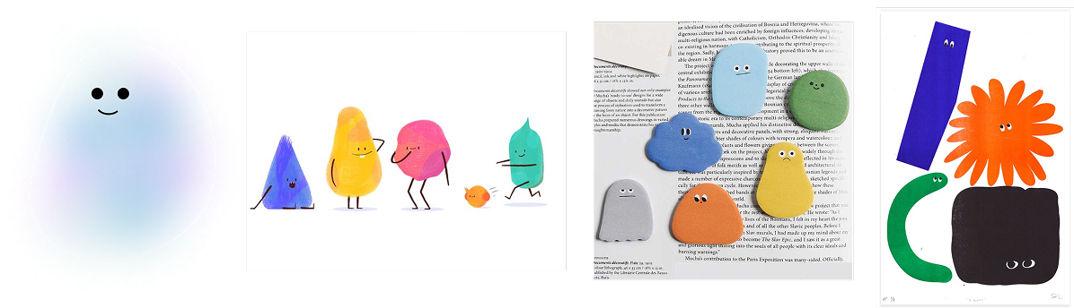
Character development - Squishy
In conceptualising the character for the Thrive platform, our vision was to introduce a mascot imbued with a warm and inviting energy, serving as a supportive companion for users navigating mental health challenges.
The creation of "Squishy," drew inspiration from the concept of a thought bubble. This mascot takes on a jellyfish-like form, characterised by its freeform and fluid appearance.
Through Squishy, we aim to establish a comforting presence within the Thrive platform, fostering a sense of companionship and support for users during their mental health journey.

User testing/ prototype overview
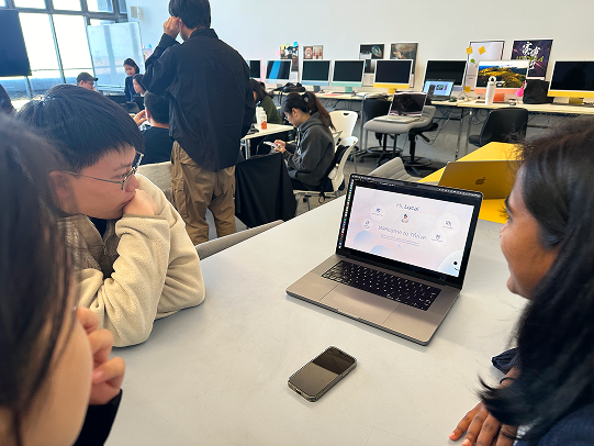
Following the creation of high-fidelity wireframes, we proceeded to develop a simplified working prototype for presentation to various groups and professors. In conjunction with this, we conducted interviews with 12 student stakeholders, garnering positive feedback on several aspects of the prototype. Specifically, stakeholders expressed appreciation for the inclusion of the Squishy character, the design style employed, and the overall flow of the platform.
Constructive feedback was also provided, urging us to implement a fixed grid system to enhance visual consistency, ensure icon uniformity across the platform, incorporate more comprehensive content within the features, and refine minor design details such as spacing, text sizing, and reducing grain on the background. These insights have been invaluable in guiding our iterative design process and refining the prototype to better meet the needs and preferences of our users.

Scenario 1
First time user
As a new international student, MyMonash is home base to access units, timetable and other crucial information. Getting started with Monash Thrive is easy, designed to be straightforward for new users. Readily available support and resources being provided helps to settle in to a new environment and thrive during your studies.
Onboarding process
Luca is a first time user of Monash Thrive, going through the onboarding process and getting started. He has been feeling frustrated with a few tasks piling up and assignments closing in and is looking for some help from Monash.
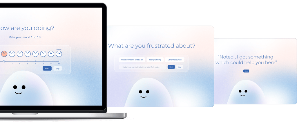
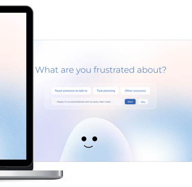
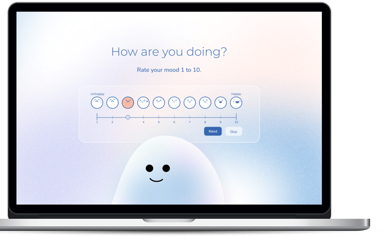
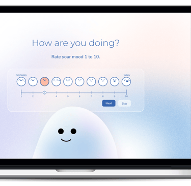
Personalisation
Take a minute to answer a few questions Squishy has asked to personalise your experience.
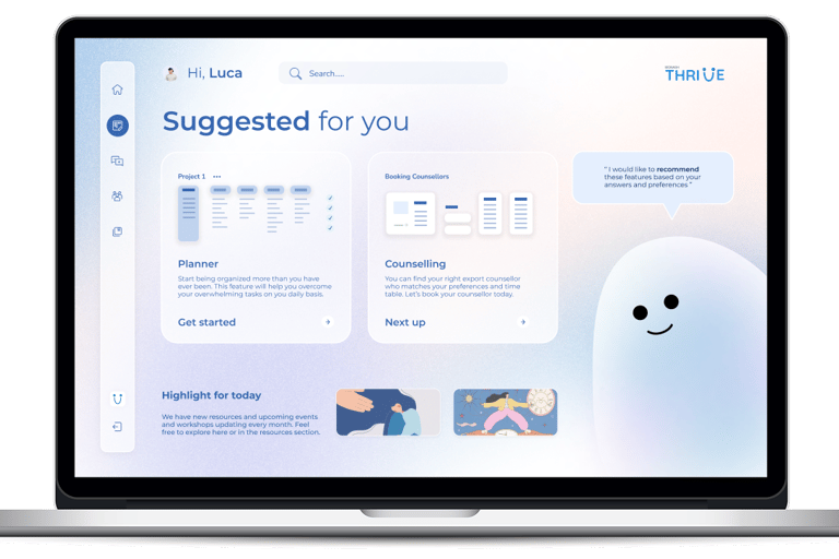
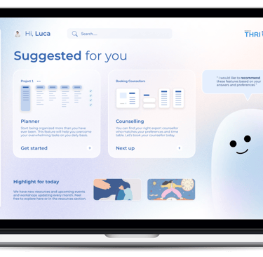
Suggested features
Main dashboard for the first time user
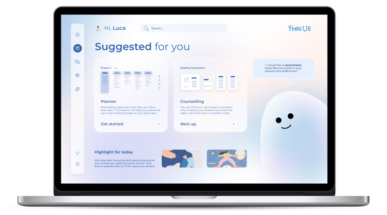
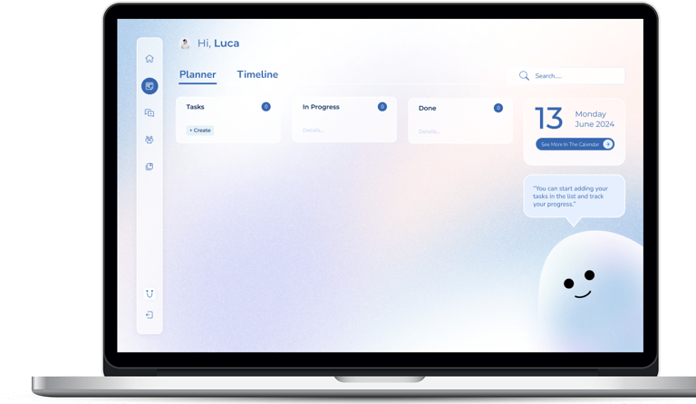
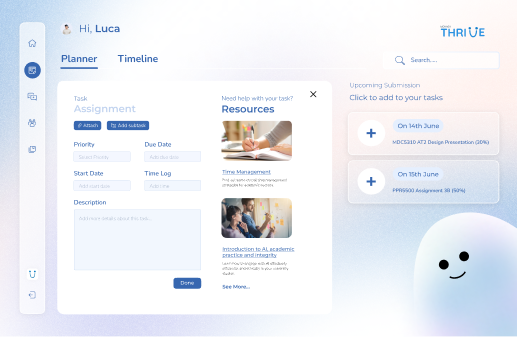
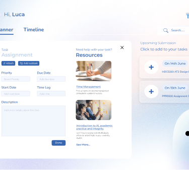
The Planner
Managing university tasks like assignments, updating WES details, or paying fees can greatly reduce stress. The MyMonash planner helps with this by providing relevant resources for each task, important reminders that automatically add to your task list, and a timeline view of all tasks. You can also set priority levels to stay organised and on track.
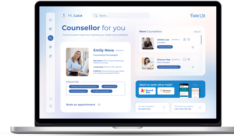

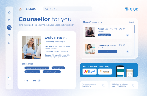
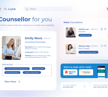
Counselling
Monash thrive provides a streamlined booking system for students to schedule counselling appointments directly within the platform. View the therapists details and have the flexibility of attending the session in person or on call.
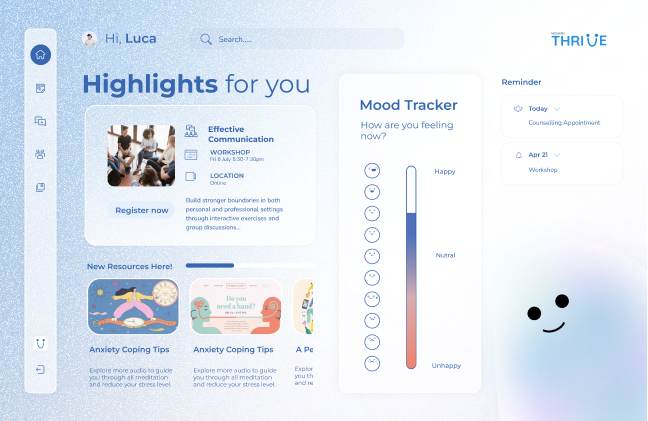
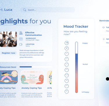
Scenario 2
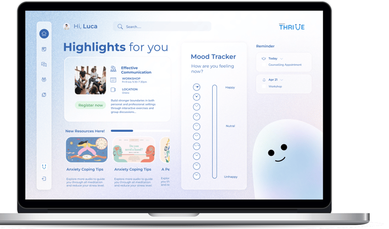
Main dashboard after first use
Using the planner feature and booking a consultation with ease, Luca feels relieved and wants to update his mood on Thrive, prompting more resources he would be willing to try based on his interests.
Outcomes
Improved discoverability by integrating directly into Moodle .
Translated emotional feedback into tangible design decisions .
Reduced overwhelm by restructuring content and prioritising relevance .
Prototype tested well with students and stakeholders.
The hardest part
The hardest part was designing wellbeing support without adding to the feeling of overwhelm. Every feature had to balance guidance with restraint to avoid increasing cognitive load.
What I'd do differently
With more time, I would test the onboarding and planner experience over a longer period to understand how student needs evolve throughout the semester and refine personalisation further.


Reflection
This project taught me how to co-create with users, present evolving ideas to non-design stakeholders, and synthesise emotional and strategic feedback into actionable UX insights. There were moments of uncertainty, like navigating conflicting feedback or testing incomplete ideas, but those challenges helped me build confidence in iteration and creative risk.
Designing Thrive reminded me that user experience isn’t just about flow, it’s about how people feel when using a product. And that feeling can’t be assumed, it has to be earned, thoughtfully and collaboratively.