This redesign project focused on reimagining the interface of an existing reading or library-related application with an emphasis on visual creativity, engagement, and storytelling through UI. While the app’s core functionality—tracking, saving, and exploring books—remained unchanged, the visual experience was completely transformed to feel more personal, inviting, and fun.
Reading App
Creative UI | UX Case Study & Design
Overview
Timeline
Tools Used
Role
4 weeks
Figma & Adobe Illustrator
Position - Sole Designer
Responsibilities - Visual concept development, UI design, style guide creation, and documentation of design rationale.
Problem Space
Dull and boring aesthetics, not fulfilling the purpose of motivating users to develop a reading habit.
Book titles need to be attractive and prioritised for users to be more interested in clicking on the book title.
Users prefer the feel of a real bookstore or library in a digitalised form.
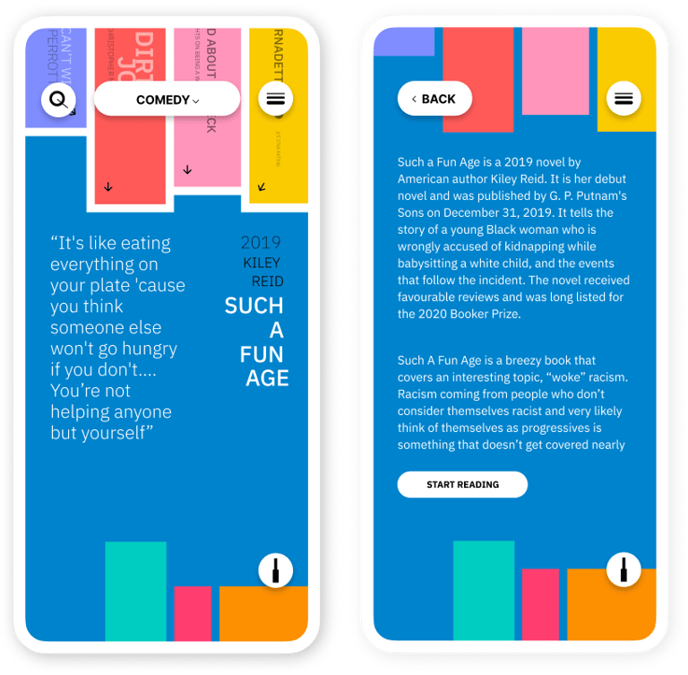
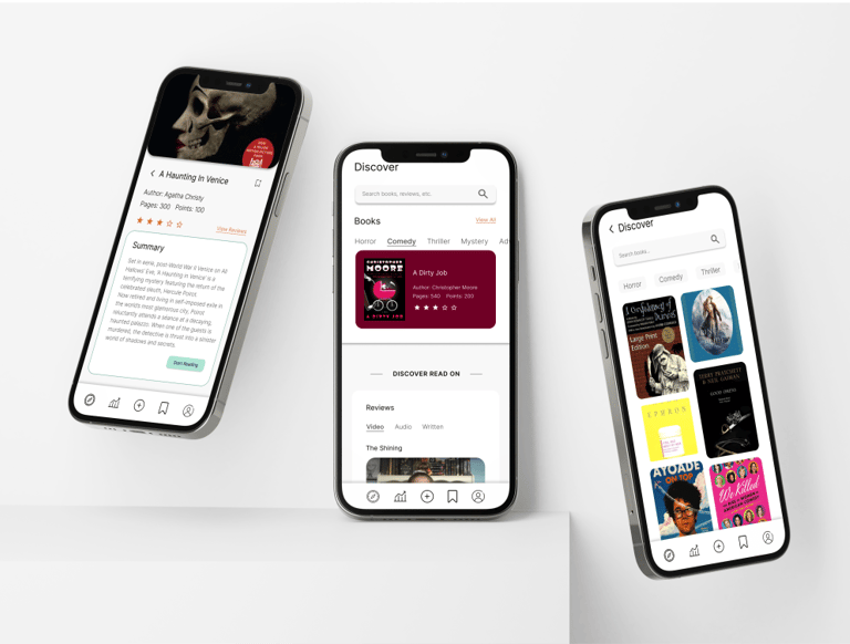
Confusing navigation and more steps required to just get to the summary of one book, cannot quickly browse the summaries and takes up more time and effort.
Solution Space
(User Research)
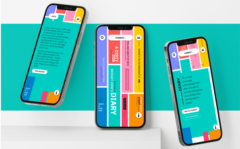
Using a fun and playful colour palette to make the UI more bright and energetic.
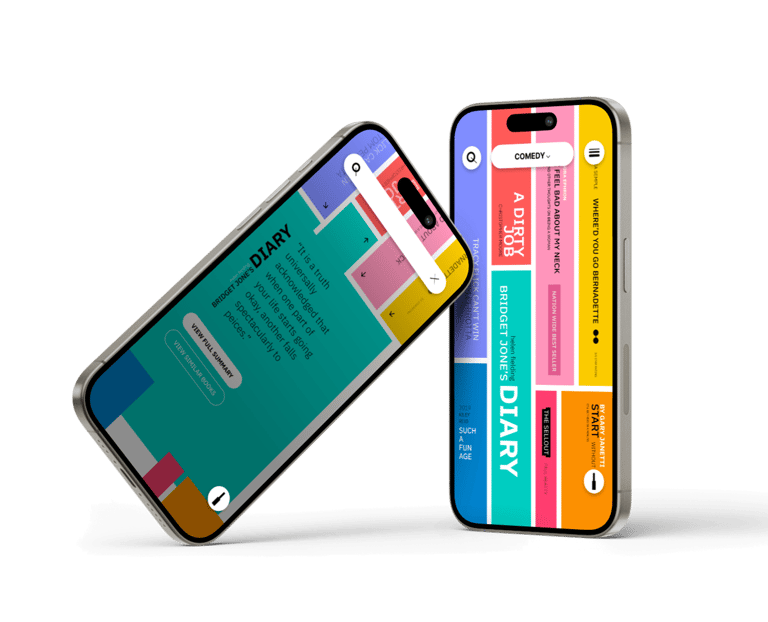
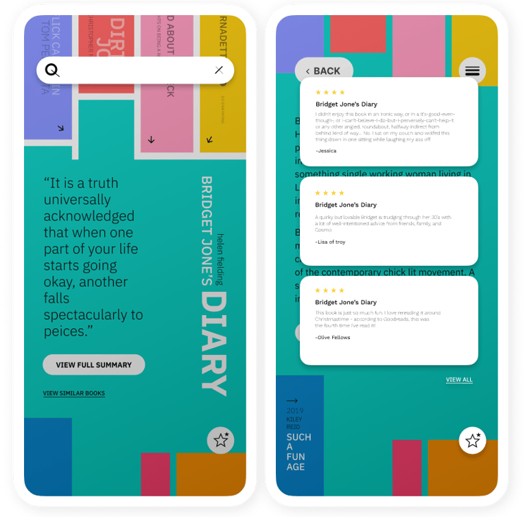
Layout organised taking inspiration from real life, displaying books and their titles as priority information and provide the aesthetics and feel of browsing through a real bookstore or library.
Shorter steps to book details and summary, making it more quicker and easy to browse.
The redesign was inspired by the tactile, visual experience of browsing a real-life bookshelf, where covers, titles, and the arrangement of books create a sense of discovery and personality. I wanted to translate that feeling into a digital space by designing an interface that felt inviting, vibrant, and familiar, like your own curated mini-library.
To move away from the often dull and rigid palettes used in traditional library apps, I introduced a playful colour scheme that adds warmth and charm to the digital shelves. The intent was to make the app feel more like a creative space than a tracker, something users would look forward to opening. The colours not only differentiated categories and actions but also added a motivational spark for users working on building a reading habit.
Concept & Inspiration
Key Improvements
Reimagined User Interface - The original app had a dated and overly clinical look. The redesign introduces a vibrant, engaging interface that invites interaction and feels more personal and joyful, especially for younger or casual readers.
Improved Visual Hierarchy - By introducing a consistent typographic scale and strong colour coding, users can now more easily distinguish between content types, summaries, genres, and actions, reducing cognitive load.
Playful but Functional Palette - Multiple bright colours were used not just for aesthetics but to subtly reinforce categories and actions. This makes the app more intuitive without relying heavily on text.
Enhanced Navigation & Interaction - Buttons and icons were redesigned to be more visible and tappable, especially on mobile devices. The introduction of rounded, contrasting buttons improves clarity while maintaining visual consistency.
Motivating Reading Experience - The redesign transforms the traditionally mundane library interface into something more game-like and energetic, helping users feel encouraged to return and engage with their reading habits.
Consistent UI Language - From icons to headers, a unified style system ensures that every element feels part of the same ecosystem—making the experience feel seamless and cohesive.
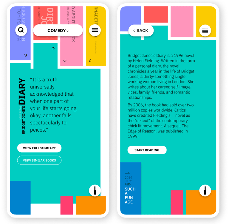
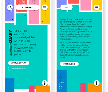
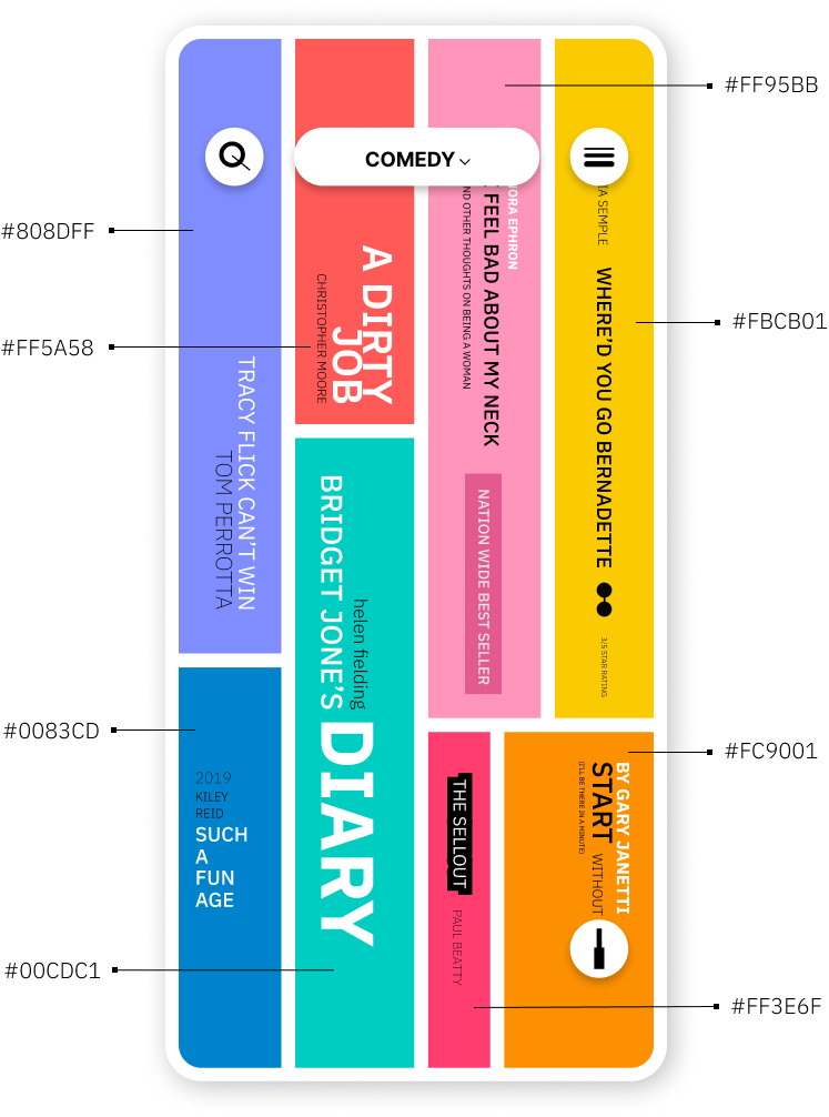
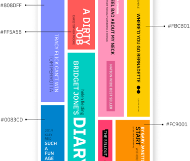
Colour Palette
Instead of relying on a single primary colour, this redesign intentionally used a vibrant, multi-colour palette to evoke energy, creativity, and joy, qualities that often get lost in traditional library or reading apps.
Primary Tones - A mix of bold, saturated colours, such as coral, teal, mustard yellow, and royal blue, were used to visually distinguish sections of the app and add personality to different user actions or content types.
Supporting Neutrals - Warm greys and soft off-whites were used as background tones to balance the vibrancy and ensure readability.
Rationale
The use of multiple colours was a direct response to the often sterile and monotonous look of conventional reading apps. These hues were chosen to make the interface feel more like a bookshelf filled with lively, diverse titles, each colour suggesting a different mood or genre. This playful palette not only enhances visual engagement but also subtly motivates users to return to the app, reinforcing positive associations with their reading habits.
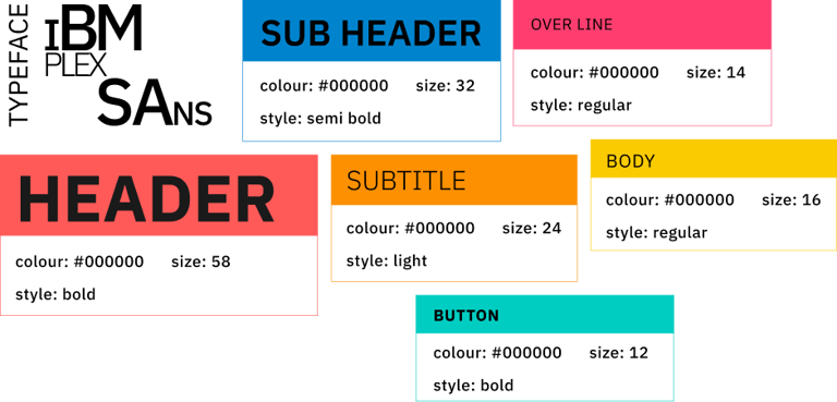
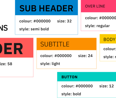
Typography
For this project, I chose IBM Plex Sans, a modern, versatile sans-serif typeface known for its clarity and personality. Its strong geometric structure allowed me to maintain high readability across multiple UI elements while supporting the playful tone of the redesign.
Each text style was assigned specific roles to guide hierarchy:
Headers (58px, bold) provided strong visual anchors.
Subheaders and subtitles balanced the layout with lighter weights and mid-range sizes.
Body text and button labels used regular and bold variations to ensure clarity in longer reads and interactive components.
The consistent typographic system helped reinforce visual rhythm and accessibility, while still feeling lively and dynamic.
Iconography
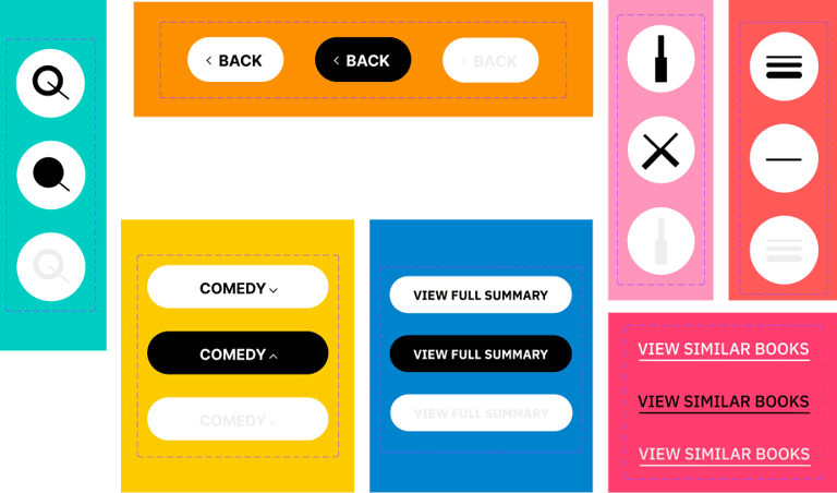
The iconography was designed to be bold, simple, and cohesive, reflecting the overall friendly and vibrant aesthetic of the app. Rounded, minimal icons were created to align with the pill-shaped buttons and colourful backgrounds, ensuring a harmonious visual language throughout the UI.
Icons served multiple functions, including:
Navigation (e.g., back, menu)
Search and category indicators
Content interaction (e.g., expand, collapse, filter)
Every icon was designed in flat monochrome with high contrast against the background to maximise visibility and maintain consistency with the multi-colour layout. The visual clarity of these icons played a key role in ensuring that playful didn’t mean confusing.
Search Bar
The search function allows users to search for any books in the database. The search icon and the cancel icon consists of bold and light strokes used to add a playfulness vibe to the overall design, something similar to playing blocks. It also adds consistency to the bold and light texts used throughout the app.
Reviews Icon
The review icon allows users to view popular top 3 reviews for the selected book and further providing an option to view all reviews provided by other readers.
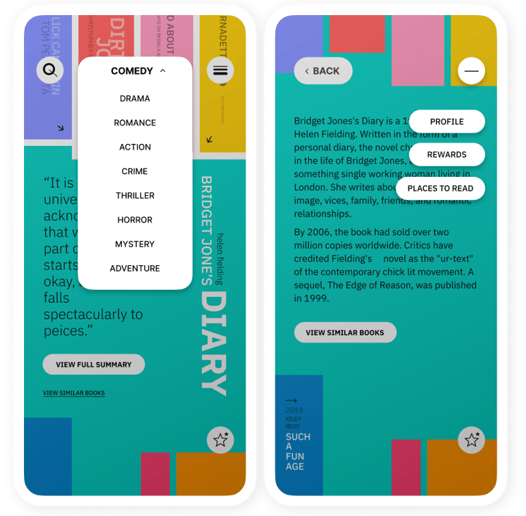
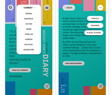
Drop Down Menu
To select the genres of the books users would want to browse. Acts as a filter, prioritised due to the main function users would look for while browsing. Using bold text to add hierarchy and differentiate between current selection and unselected genres.
More Menu
More menu offers navigation to user profile, reviews of books, rewards and places to read, the secondary features of the app, accessible at any stage.
Alternate Scenario
To select the genres of the books users would want to browse. Acts as a filter, prioritised due to the main function users would look for while browsing. Using bold text to add hierarchy and differentiate between current selection and unselected genres.
Reflection
Redesigning the library app was an opportunity to transform a dull, outdated interface into a vibrant, user friendly experience. With no existing design language to guide me, I had full creative freedom, and the responsibility to define the app’s tone, structure, and system from the ground up. Drawing inspiration from real-world bookshelves, I used intuitive metaphors, bold colours, and friendly iconography to create a playful yet purposeful environment. This balance between expressive visuals and practical functionality made key tasks like browsing genres, viewing summaries, and discovering similar books more intuitive and engaging.